Usability
Rsearch
+
Data
Analysis
+
Redesign
Background
The OS&OT department aims to move all website content from Wix to Drupal. Before moving it, we want to collect stakeholder feedback to evaluate the current website and turn insights into design to improve the user experience.
Part-time contract (work-study)
09.2024 - 03.2025
Tool
Excel
Screaming Frog
Figma
Conducted Website troubleshooting, and reported a total of 17 usability problems
Analyzed Website traffic data using Excel, found major pain points in the navigation system
Designed and conducted User research, including interviews with 2 users and a survey with 62 responses
Design the Final Prototype, and implemented pages on the content management system Drupal
Project Overview
Stakeholder Purpose

Project Goal
User Goal:
Through Heuristic evaluation, traffic data analysis and usability tesing, we aim to make the website more efficient, accessible and easy to navigate for [students] and [clinical partners] to increase website reachability and decrase the workload of placement coordinator.
Project Timeline

Identify Functionality Issue
General website evaluation
Total of 17 issues were found, including 6 broken links, 4 content inconsistece, 5 navigation error, 2 non-responsive button

Website Traffic Data Analysis
Methodology
Click-through rates, Page visits, Device usage, Navigation flow, In-box Questions, Button Clicks
Wix Analytics (collecting data)
Excel (analysis)
Key Insights
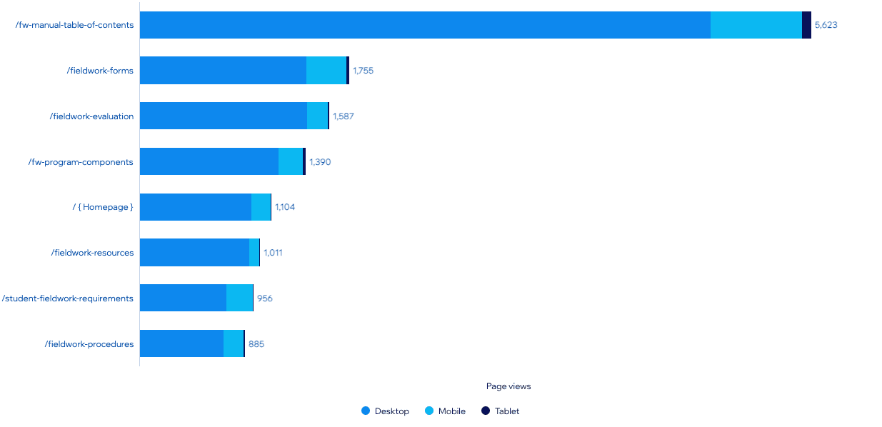
• Manual Table Links Are Overwhelming and Underused
Many links on the manual table page have 1–3 clicks in a year despite high page views (e.g., WSIB Declaration, Student Responsibilities Form, COTO Documents). This points to low readability or poor link visibility in the current layout.

Figure: Mannual page

Figure: Link with CTR
• Navigation Drop-Off Indicates Confusion
28% of users exit after viewing only one page, hinting that the site may not immediately direct users to what they need. Navigation may need simplification or clearer guidance.

• Mobile Access Is Rising, Especially On-the-Go Pages
While most views come from laptops, some pages show high mobile ratios—like Student Fieldwork Requirements (22.9%) and Fieldwork Forms (19.3%). This suggests students often access these while off-campus, like during placements.
• Certain Pages Are High-Impact but Under-Visited
Pages like IPE Fieldwork Requirements have high CTR (10%) but fewer visitors (571), indicating they are important to a niche audience (e.g., preceptors or IPE students) but might not be well-promoted or easy to find.

Recommendations
• Enhancing searchability and readability of important resources
• Improving mobile experience for high-mobile-ratio pages.
User Survey and Interview
Methodology
Method
Online questionnaire
one-to-one User interview
Metrics
Navigation usability, Content accuracy, Form acessability, Mobile experiences
Tool
Microsoft Forms (survey design)
Zoom (Interview)
Excel (analysis)

Figure: Online survey example
What I did?
I designed the survey and implemented all the questions in Microsoft form
Drafted Email for distribution, analyzed the data into actionable suggestions
Key Insights
• Users Prefer Embedded In-Text Links Over Summary Pages
Instead of navigating to a separate table summary page, users find it more convenient to access forms via direct in-text links within relevant content. This reduces extra steps and improves usability.

Figure: Word cloud
• Mobile Navigation Usability Needs Improvement
33% of users rate mobile navigation as difficult, indicating that the website lacks responsiveness or ease of access on smaller screens. This suggests that elements such as links and buttons may be too small or poorly placed for mobile users.

• Different Stakeholders Have Different Preferences
Students and clinical partners have distinct content priorities. While students focus on evaluations and requirements, clinical partners seek resources for preceptors and scheduling. A unified structure may not serve both groups efficiently.

Student top visit

Clinical partner top visits
Actinable Recommendations
• Keep the form page while simplifying access to forms directly from relevant content.
• Enhance mobile usability with responsive designs and larger, tappable elements.
• Split the content which specific for clinical educators apart from the general page, making it less destructive for different stakeholders.
Key Insights (Interview)
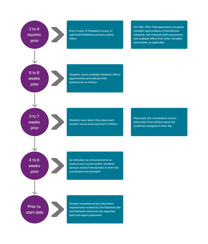
• Placement Timeline/Process Unclear
2/2 users expressed a need for more transparency about when and how placements will happen. A visual placement process flowchart can help users better understand the steps involved.

Figure: Placement process flowchart
• Content Feels Cold and Hard to Navigate
"The content in each page seems a bit cold. It is not easy for me to find the information I need within a seconds."
Users find the content uninviting and difficult to scan quickly for key information. Implementing drop-down menus can improve readability and make navigation more intuitive.

Using Drop Down Menu
Redesign
From evaluation results to design
Wireframe
Goal
Merge the Fieldwork website content into the department's website
Turn the top navigation bar into a Mega Menu
Add a left panel as a local navigation system

Figure: Fieldwork Tab

Figure: Mega Menu
Prototype & Implementing
Tool
Figma | Drupal
Cooperate fieldwork content as one tab into department’s main website
Mega menu redesign

Left side local navigation panel

Fieldwork Process Flow chart redesign