Work Collection
Work Collection

Invisible Accessible Database
Invisible Accessible Database
Helping U of T students find spaces that support how they focus, rest, and regulate.
Helping U of T students find spaces that support how they focus, rest, and regulate.
Finding a place to sit is easy. Finding a place that actually works for you is not.
Finding a place to sit is easy. Finding a place that actually works for you is not.
View Interactive Prototype ↗

Project summary
Project summary
Role
Timeline
Team
Deliverable
UX Research
Information Architecture
UI Design
8 weeks
3 UX designers
Laptop & Mobile accessible space database prototype
Read the project story ↗
Team
Deliverable
3 designers
Mobile-first accessible space database prototype
Project highlight
15
Buildings

22
Hours

125
Spaces

295
Photo Taken

01 / The Challenge
A campus map can tell students where a space is.
It cannot tell them whether the space will work for them.
A campus map can tell students where a space is.
It cannot tell them whether the space will work for them.
A campus map can tell students where a space is.
It cannot tell them whether the space will work for them.
Existing tools answer location-based questions, but they leave a meaningful information gap around sensory, cognitive, and emotional fit.
Existing tools answer location-based questions, but they leave a meaningful information gap around sensory, cognitive, and emotional fit.
Existing tools tell users
• Is there an accessible entrance?
• Is there a washroom?
• Is there a study room?


Students also need to know
• Is it quiet enough to focus?
• Is the lighting overwhelming?
• Can I sit somewhere private?
• Can I move or change my posture?
“Is there a space?”
“Will this space work for me?”
How might we
How might we help students with invisible disabilities identify campus spaces that support their sensory, cognitive, and emotional needs?
How might we help students with invisible disabilities identify campus spaces that support their sensory, cognitive, and emotional needs?
How might we help students with invisible disabilities identify campus spaces that support their sensory, cognitive, and emotional needs?
02/ Research Insight
We started by defining what “supportive” actually means.
We started by defining what “supportive” actually means.
We started by defining what “supportive” actually means.
We translated broad accessibility concepts into observable environmental attributes.
We translated broad accessibility concepts into observable environmental attributes.
Sensory environment
Sensory environment
Sensory environment
Noise level, lighting, visual noise
Noise level, lighting, visual noise
Noise level, lighting, visual noise
Cognitive support
Cognitive support
Cognitive support
Intuitive navigation (clear signs)
Intuitive navigation (clear signs)
Intuitive navigation (clear signs)
Emotional safety
Emotional safety
Emotional safety
Privacy
Privacy
Privacy
Flexibility
Flexibility
Flexibility
Ability to move
Ability to move
Ability to move
03/ Field Research
We turned invisible experiences into structured field data.
We translated broad accessibility concepts into observable environmental attributes.

How did we able to scan 125 spaces in 22 hours?
How did we able to
scan 125 spaces
in 22 hours?
How did we able to scan 125 spaces in 22 hours?
1
Built a standardized checklist.
2
Collected 125 space of data with photo in a shared spreadhseet.
3
Refined the taxonomy in the field.


Checklist


Data spreadsheet
Data spreadsheet

How Rich is our data?
How Rich is our data?

8 major types of spaces

Support 6 types of invisible disabilities
What I Learned: Evolution
We learned that not every meaningful experience can become a reliable database field. OUR CHECKLIST NEED EVOLUTION.
We learned that not every meaningful experience can become a reliable database field. OUR CHECKLIST NEED EVOLUTION.
We learned that not every meaningful experience can become a reliable database field. OUR CHECKLIST NEED EVOLUTION.
Checklist Evolution
Transform subjective qualities to objective observable categories
Transform subjective qualities to objective observable categories
1
Removed subjective criteria
2
Clarified ambiguous categories
3
Retained attributes that could be consistently observed

04 / The Key Turning Point
From raw observations to design decision factors.
From raw observations to design decision factors.
From raw observations to design decision factors.
Raw observation → Structured field data → User-facing decision factor
Raw observation → Structured field data → User-facing decision factor
Database translation
Turning visible cues into searchable space qualities
Turning visible cues into searchable space qualities
Each observation was converted into a database field and then rewritten as clear user-facing language for people looking for accessible, low-friction study spaces.
Each observation was converted into a database field and then rewritten as clear user-facing language for people looking for accessible, low-friction study spaces.
Observation
Database field
User-facing language
Whisper-level conversation
Quiet
Quiet space
Seating behind partitions
Semi-private
Semi-private seating
Wheeled chairs
Movable chairs
Adjustable seating
Clear building directory + room label
Easy to find
Easy navigation
05 / Design Direction
Designing for fast, low-effort decisions
Designing for fast, low-effort decisions
Designing for fast, low-effort decisions
Help students find the supoortive spaces by searching in our database.
Help students find the supoortive spaces by searching in our database.
Design principle
How would field research lead to our design?
How would field research lead to our design?
Principle 1 .
Start with intent, not filters
Principle 2.
Make invisible qualities scannable (e.g., tags, filters, and categories)
Principle 3 .
Prioritize proximity (e.g., walking distance)
Core design elements (wireframs)
What are our fundamental features?
What are our fundamental features?


(Umbrella buttons)
(Umbrella buttons)
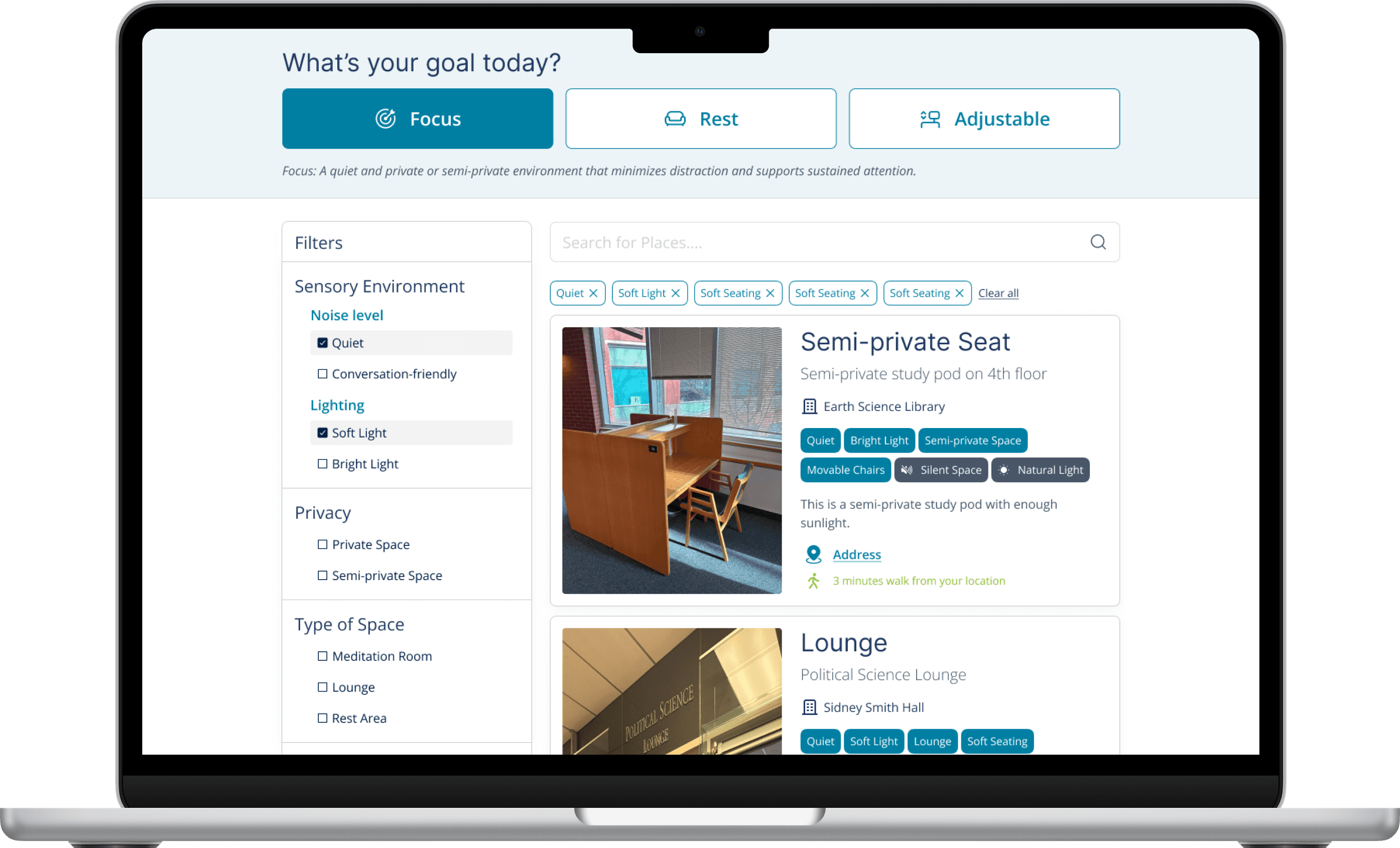
The quick action button, which ask users about their goal for the day
— such as focus, rest, or flexibility, and quickly filter the space by just one click.
The quick action button, which ask users about their goal for the day
— such as focus, rest, or flexibility, and quickly filter the space by just one click.

(Space card)
(Space card)
Contains space photo, space type, space name, spaces criteria in tags, short intro and direction buttons.
Contains space photo, space type, space name, spaces criteria in tags, short intro and direction buttons.

(Tags / bonus tags)
(Tags / bonus tags)
List out the space qualities
List out the space qualities

(Direction button to Google map)
(Direction button to Google map)
Redirect users to Google Maps, providing guidance of how to get there.
Redirect users to Google Maps, providing guidance of how to get there.

(Filters)
(Filters)
Instant responsive filters that users could not only browse spaces but also act on what they need.
Instant responsive filters that users could not only browse spaces but also act on what they need.
06 / Usability Testing
Testing revealed where our language and hierarchy failed users.
Testing revealed where our language and hierarchy failed users.
Testing revealed where our language and hierarchy failed users.
From testing results to design revolution
From testing results to design revolution
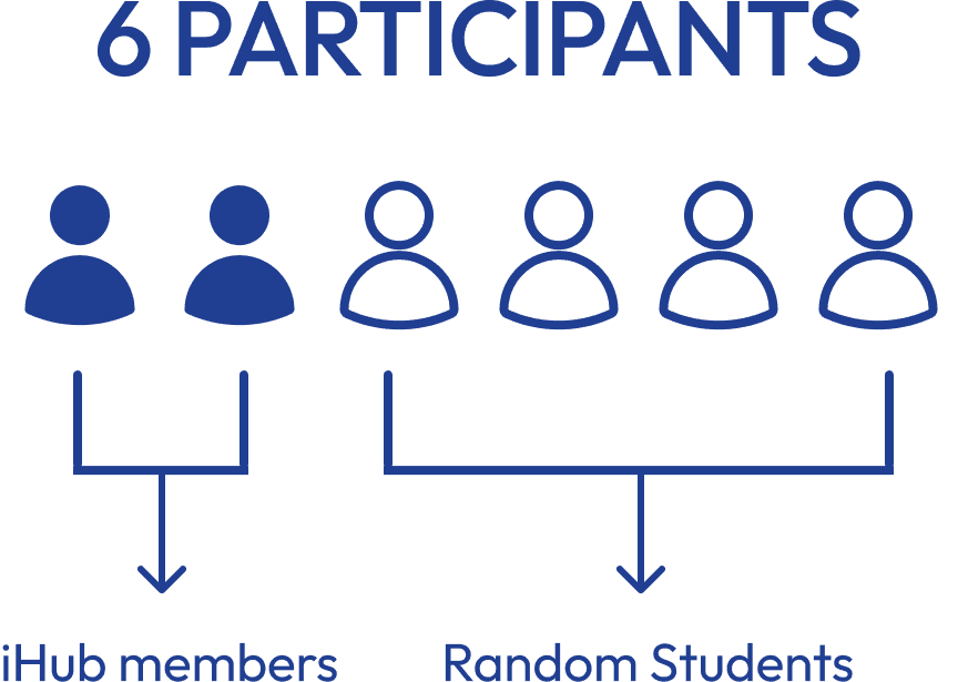
Testing biref


Affinity Diagram
Iteration: Changes we made
Insight 1
Insight 1
The flexibility button does not align with users’ mental models
The flexibility button does not align with users’ mental models
Evidence :
Evidence :
2/2 users failed the task involving “Flexibility.”
2/2 users failed the task involving “Flexibility.”
Changes :
Changes :
Renamed from [Flexibility] to [Adjustable] seating, and changed icon.
Renamed from [Flexibility] to [Adjustable] seating, and changed icon.
Redesign comparison
Before → After
Before
Before

After
After

Insight 2
Insight 2
Tags had low visibility/redability (color chaiotic)
Tags had low visibility/redability (color chaiotic)
Evidence :
Evidence :
3/6 users did not notice bonus tags, such as Natural Light.
3/6 users did not notice bonus tags, such as Natural Light.
Changes :
Changes :
Increased contrast, simplified tag colors, and clarified visual hierarchy
Increased contrast, simplified tag colors, and clarified visual hierarchy
Redesign comparison
Before → After
Before
Before

After
After

Insight 3
Insight 3
Address direction action unclear
Address direction action unclear
Evidence :
Evidence :
3/6 participants prioritized proximity when selecting a space.
3/6 participants prioritized proximity when selecting a space.
Changes :
Changes :
Made the experience mobile-first and surfaced walking time directly on cards.
Made the experience mobile-first and surfaced walking time directly on cards.
Redesign comparison
Before → After
Before
Before

After
After

06 / Final Outcome
Building an Interactive Prototype with Figma Make
Building an Interactive Prototype with Figma Make
Building an Interactive Prototype with Figma Make


The final concept helps students move from “Is there a space?” to “Will this space support me today?”
The final concept helps students move from “Is there a space?” to “Will this space support me today?”
Key features
Why use AI as an assistant
1 ) Goal-based entry points
1 ) Goal-based entry points
Instead of asking users to start with complex filters, Focus, Rest, and Adjustable help users start from their current need.
I used Figma Make to build an interactive filtering experience that allowed users to combine multiple accessibility criteria and dynamically narrow down results. This complex filtering function cannot be implemented through figma design.
Instead of asking users to start with complex filters, Focus, Rest, and Adjustable help users start from their current need.

2 ) Needs-based filters
2 ) Needs-based filters
Users can combine noise, lighting, privacy, seating, and space type criteria.
I used Figma Make to build an interactive filtering experience that allowed users to combine multiple accessibility criteria and dynamically narrow down results. This complex filtering function cannot be implemented through figma design.
Users can combine noise, lighting, privacy, seating, and space type criteria.

3 ) Scannable space cards
3 ) Scannable space cards
Each card surfaces tags, special features, walking distance, and address that redirect users to the map.
I used Figma Make to build an interactive filtering experience that allowed users to combine multiple accessibility criteria and dynamically narrow down results. This complex filtering function cannot be implemented through figma design.
Each card surfaces tags, special features, walking distance, and address that redirect users to the map.

4 ) Detailed space page
4 ) Detailed space page
Providing more photos and specific in-building direction after users click in the sapce card.
I used Figma Make to build an interactive filtering experience that allowed users to combine multiple accessibility criteria and dynamically narrow down results. This complex filtering function cannot be implemented through figma design.
Providing more photos and specific in-building direction after users click in the sapce card.

AI as an assistant
Why use AI as an assistant
I used Figma Make, Figma’s AI-powered prototyping feature, to build an interactive filtering experience that allowed users to combine multiple accessibility criteria and dynamically narrow down results.
I used Figma Make to build an interactive filtering experience that allowed users to combine multiple accessibility criteria and dynamically narrow down results. This complex filtering function cannot be implemented through figma design.
I used Figma Make, Figma’s AI-powered prototyping feature, to build an interactive filtering experience that allowed users to combine multiple accessibility criteria and dynamically narrow down results.

Design library
Why use AI as an assistant
How we were able to make our design consistant?
I used Figma Make to build an interactive filtering experience that allowed users to combine multiple accessibility criteria and dynamically narrow down results. This complex filtering function cannot be implemented through figma design.
How we were able to make our design consistant?

07 / Reflection
What I learned
What I learned
What I learned
This valuable learning experience pushed me to connect research, accessibility, and interface design in a very practical way.
This valuable learning experience pushed me to connect research, accessibility, and interface design in a very practical way.
· Accessibility is experiential, not only technical.
· Goal-based entry points
True accessibility also encompasses noise, privacy, lighting, predictability and choice.
I used Figma Make to build an interactive filtering experience that allowed users to combine multiple accessibility criteria and dynamically narrow down results. This complex filtering function cannot be implemented through figma design.
True accessibility also encompasses noise, privacy, lighting, predictability and choice.
· Language is part of the interface.
· Goal-based entry points
Test failure explanation for “Flexibility”: a single ambiguous term is enough to undermine what would otherwise be a perfectly reasonable feature.
I used Figma Make to build an interactive filtering experience that allowed users to combine multiple accessibility criteria and dynamically narrow down results. This complex filtering function cannot be implemented through figma design.
Test failure explanation for “Flexibility”: a single ambiguous term is enough to undermine what would otherwise be a perfectly reasonable feature.
· Data needs translation before it becomes useful.
· Goal-based entry points
Research data does not automatically become a useful product; it needs to be transformed into decision-making tools that users can understand through taxonomy, labels, filters and hierarchy.
I used Figma Make to build an interactive filtering experience that allowed users to combine multiple accessibility criteria and dynamically narrow down results. This complex filtering function cannot be implemented through figma design.